
PR expert Mark Borkowski told The Sun the re-brand, by agency Bulletproof, could easily have cost £1million. Cadbury disputed this, saying it was less than half that figure but would not confirm the exact amount.
A Cadbury spokesman said: ‘The Cadbury logo redesign is part of a much wider brand refresh which began over a year ago and touches all Cadbury visual assets.
Borkowski said the national favourite was right to keep the changes subtle to avoid alienating customers.

The chocolate giant said the change, to be plastered on bars of Dairy Milk along with other favourites, will make them ‘look and feel more natural, authentic and high quality’.
‘The revitalisation of the Cadbury wordmark drew inspiration from the hand of founder John Cadbury himself to create a beautifully crafted signature with a more contemporary feel,’ they said.
The chocolate giant, renowned for its iconic chocolate bars, which range from Dairy Milk and Bournville to the Twirl, Wispa and Crunchie, has unveiled a new design.
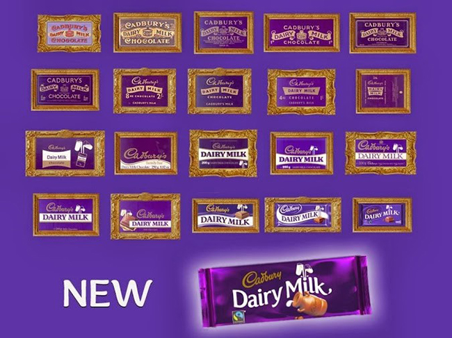
In a cleaner image, the new logo lacks the thick lettering of the previous version, with a slightly modified tilt to the word ‘Cadbury‘.
The chocolatier, based in Bournville, issued a statement over the revamp, claiming the new logo “puts the humanity back” into the design.
The new logo will appear in Australia next month, and in the UK in 2021.
Cadbury, now owned by Mondelez, has been slammed on social media over the new logo, though.
One branded it “fruit and nuts”, but Cadbury said: “Dairy Milk is the nation’s favourite chocolate brand with a rich heritage and feeling of nostalgia.”
Cadbury said the change will make bars “look and feel more natural, authentic and high quality.”